


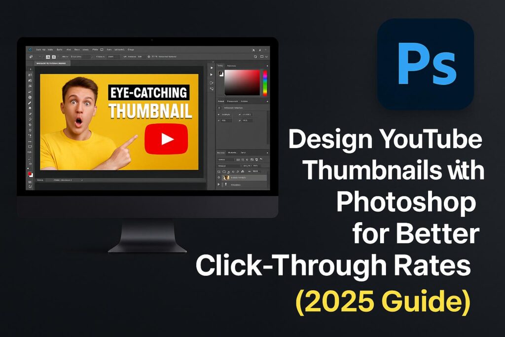
If you’re serious about growing your YouTube channel, your thumbnail design is one of the most important factors in driving traffic. Even with amazing content, your video won’t get clicks if the thumbnail doesn’t stop the scroll.
Luckily, Adobe Photoshop gives you total control over your thumbnail’s look—allowing you to design custom, attention-grabbing visuals that increase your click-through rate (CTR).
In this guide, you’ll learn how to:
- Set up the right canvas size and resolution
- Add compelling visuals, text, and effects
- Use design psychology to attract clicks
- Export thumbnails optimized for YouTube
Whether you’re a vlogger, gamer, educator, or business, this guide is packed with practical steps and pro tips.
Why Thumbnails Matter for YouTube Success
YouTube thumbnails act as visual headlines. In fact:
- 90% of top-performing videos have custom thumbnails (YouTube Creator Academy)
- An eye-catching thumbnail can increase CTR by up to 60%
A good thumbnail:
- Creates curiosity
- Clearly shows what the video is about
- Connects emotionally through expressions, colors, and bold fonts
🎯 Think of it as an ad for your video.
YouTube Thumbnail Specs (2025)
Before we jump into Photoshop, use these specifications:
| Setting | Recommended Value |
|---|---|
| Dimensions | 1280 x 720 pixels |
| Aspect Ratio | 16:9 |
| File Size | < 2 MB |
| Format | .JPG, .PNG, or .WEBP |
| Resolution | 72–150 PPI (web) |
Step 1: Set Up Your Canvas in Photoshop
1.1 Create a New Document
- File > New
- Width: 1280 px
- Height: 720 px
- Resolution: 150 PPI
- Color Mode: RGB
1.2 Create Guides
- View > New Guide Layout
- Use a grid overlay to align text and focal points
- Set a “safe zone” (center 80%) to prevent mobile cropping
🧠 Save this setup as a Photoshop template for future use.
Step 2: Add Your Background Image or Cutout
2.1 Import Your Image
- Drag-and-drop or File > Place Embedded
- Use a still from the video or a relevant photo
2.2 Apply Blur or Gradient
- Add a Gaussian Blur to make text pop
- Use Gradient Map or overlays to boost mood/tone
2.3 Use Subject Cutouts
- Use Select Subject > Mask to isolate faces or items
- Add drop shadows or outlines to separate them from the background
🖼️ High-contrast cutouts draw the eye—especially faces and emotions.
Step 3: Add Bold, Readable Text
3.1 Use Adobe Fonts
- Choose bold sans-serif fonts like Anton, Bebas Neue, Montserrat
3.2 Make It Pop
- Add Stroke (2–4px white or black)
- Use Drop Shadow for depth
- Limit to 3–5 words max
3.3 Align and Scale Text
- Use Transform (Cmd/Ctrl + T) to adjust size
- Keep text inside the mobile safe zone
💡 Text should be legible at thumbnail size—don’t overcomplicate.
Step 4: Apply Design Effects That Boost CTR
4.1 Use Outlines and Glow
- Duplicate layer > Add Stroke or Outer Glow
- Helps the subject stand out on any background
4.2 Add Arrows, Circles, or Emojis
- Use custom shapes or PNGs
- Point to the action or highlight text
4.3 Create Depth with Shadows and Highlights
- Use Curves Adjustment Layers to increase contrast
- Add Vignette using a soft black gradient
🎨 Visual hierarchy is key—make the thumbnail “readable” in 1 second.
Step 5: Export the Thumbnail for Upload
5.1 Save as Web-Optimized JPG/PNG
- File > Export > Export As > JPG or PNG
- Quality: 80–100%
- Check file size (under 2MB)
5.2 Name Your File with Keywords
- Example: “how-to-design-thumbnails-2025.jpg”
🧾 Thumbnails can influence search rankings when named strategically.
Pro Tips: Design Psychology for More Clicks
- Use Close-Up Faces with Expressions
- Eye contact and emotion build connection
- Use Contrasting Colors
- Red vs yellow, blue vs orange, dark vs light
- Create a “Zoom Effect”
- Subject fills the frame for instant recognition
- Add Curiosity
- Use arrows, question marks, or partial reveals
- Be Consistent
- Use brand colors, fonts, and layouts for recognizability
🔍 Thumbnails are about attention—capture it in milliseconds.
Bonus: Download Free PSD Thumbnail Template
🎁 Speed up your design with this free thumbnail starter pack:
Includes:
- 1280×720 base canvas
- Smart object text and image placeholders
- Effects: Stroke, Shadow, Glow
- Compatible with Photoshop CC 2022 and later
Use it as a base for your next YouTube series!
Common Thumbnail Mistakes to Avoid
- ❌ Too much text (no one reads it all)
- ❌ Low contrast = unreadable
- ❌ Stock image overuse (no personality)
- ❌ Small fonts (can’t see it on mobile)
- ❌ Busy designs (hard to scan visually)
✅ Keep it simple, bold, and click-worthy.
FAQs: Designing Thumbnails in Photoshop
Q: Do I need to use Photoshop for thumbnails?
A: No, but Photoshop offers unmatched control and quality.
Q: Can I edit thumbnails on mobile?
A: Use Photoshop Express or Premiere Rush for limited features.
Q: What’s the best font size?
A: Depends on text, but aim for 60pt–120pt scale on 1280×720 canvas.
Q: Can I reuse the same layout?
A: Yes! Create a template and just swap text and images.
Q: Should I add YouTube branding or icons?
A: Avoid official YouTube logos—focus on custom brand identity instead.
Conclusion + Try Adobe Creative Cloud
Thumbnails are the first impression of your content—and Photoshop gives you the power to make it count. With the right layout, color, and design psychology, you can dramatically improve your click-through rate and grow your channel.
🎯 Start designing with the tools the pros use.
👉 Try Photoshop with Adobe Creative Cloud